
I’ve taken far fewer images this year compared to usual, and so recently I’ve been dipping into the archives for images to post. Sometimes an image just comes to mind, or I glance back and spot images that I meant to process. On other occasions the decision is made for me by external events. The topic for the WordPress weekly challenge this week is ‘On the Way’, and an image came to mind. I always regard a journey as an opportunity for images and a camera is usually easily accessible if not physically in my hand when I travel, and those of you who follow my blog will have seen some of the images I’ve taken ‘en route’.
I was travelling back up to London from Margate last Autumn and spotted a man on a platform (can’t remember where) and grabbed a shot with my Compact (Canon G10). The original was frankly rubbish, and I’m not going to show it to you in the body of this Post, because it’s so poor and if it was shown as the headline image for this post in the WordPress reader then this post would never get a second glance, but you can view it by clicking here so that you can see the starting point. I don’t know why it didn’t go to the Trash bin straight away. But clearly I saw something to work on because three days after it was shot I produced this image:-
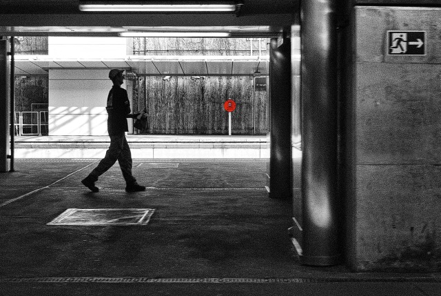 It has sat on the hard drive ever since and I’ve looked at it periodically. It’s an image that I like, but don’t really like. It’s an image that is a victim of the G10’s wake-up delay. That fraction of a second’s delay between me pressing the shutter and the camera deciding to play ball was enough for the man’s nose to ‘encounter’ something dark on the wall behind him, and worse – what he was carrying in his hand (a drink and a bag containing his lunch) was lost in the darkness of the wall completely. And that was the problem. A so-nearly-good shot lost. Or was it lost…?
It was raining last Sunday and I took a look at this again and thought: maybe I can move the man. An hour later I had successfully moved the man, plus his drink, but his lunch bag disappeared in the process, deliberately.
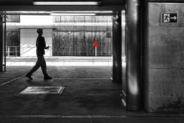 Click on either image to see a larger and sharper image
My wife doesn’t think this is an improvement, and gives as her reasons: the man has a slightly odd posture anyway, and the arm holding his lunch looks awkward and was conveniently less obvious in the original (thanks to the dark wall). I agree about the arm – it is awkward. His right arm is I think folded across his chest and his left arm holds his lunch and drink. The arm doesn’t look natural and once you’ve noticed that, it tends to be the one aspect that your eye keeps going back to.
The question is: was the image really worth an hour’s work? Was the image worth rescuing? Has it been improved?
So, it’s over to you: what do you think? Do post a comment, and let’s see what the verdict is.


Andy, I think your hour’s work has paid off. You’re agonising over the picture a bit, but that’s only natural as its your picture. But to me, seeing these images for the first time, I think that moving the man has worked, tho I’m not sure its something I’d do, as I lack the know how and I’m lazy! But I must say that what first drew my attention to this shot is that little red sign – very good use of restored colour – subtle! Good stuff! Adrian
LikeLike
Thanks Adrian. This was tricky work – probably the most difficult bit of cloning I’ve done – but I always believe we learn by doing, and I learnt a lot in the process. Glad you liked that spot of red.
LikeLiked by 1 person
Definitely worth the effort in my opinion Andy. You’ve satisfied yourself over the ‘what might have been’ question and besides, a good practise with these techniques is never wasted. I like the picture, awkward posture aside! 🙂
LikeLike
Thanks Adrian. And you are right: the more we experiment in Photoshop, the better we become at using tools like the clone tool
LikeLike
Worth the effort, and well done, too. But an alternative, and I offer it only because your wife doesn’t agree, is to move the building rather than the man. Just thinkin’.
LikeLike
Thanks Ken, and thanks for the suggestion. The mouse batteries have just died – how’s that for an original excuse! And, my wife would not be fooled by my attempts to move the station rather than the man!
LikeLike
I think it was worth it, Andy….a good bit of work. It’s really fiddly stuff working with the clone tool.
LikeLike
Thanks Sue. Obsessional stuff working with the clone tool for an hour!
LikeLiked by 1 person
I would say it is…and not something I would have the patience with…..
LikeLike
Although the former journalist in me balks at altering an image to this extent, the photographer in me sees your final result as a huge improvement. I think the image is proof of an hour very well spent.
LikeLike
Thanks for your comment Heather. I hasten to add that I would not alter a landscape or a building, or anything else recognizable for that matter, but in instances like this I feel there is reasonable artistic licence. And, it is always a skill-enhancing exercise. I’m pleased you think it was worth the effort.
LikeLiked by 1 person
Well, ummmm… I much prefer the first photo. Here’s why. What caught my eye first was the stylized man in the sign at the right. Then, it moved to the man walking along, whose pace is more leisurely. Then, I looked again at the sign and thought, “Two ways of moving through life.”
In the first photo, the man and the sign seem more balanced. In the second, the emphasis is all on the man, breaking the link between the two. In terms of image, the second might well be “better,” but in terms of narrative, I prefer the first.
LikeLike
Always, Linda, you have an original comment, and I thank you for that. I’m a little surprised that (according to the stats) no one has taken up the option of viewing the original image. The first think I did when I started work on the original was to flip it horizontally. The ‘men’ were all going from right to left. I was tempted to remove the running man on the wall but left him in although bizarrely it had not occurred to me how he fitted the narrative you describe. What I did remove was a block of writing a little lower down, which of course was back to front as well as blurred as a consequence of reversing the flow of the image. My wife will be delighted she has you on-side!
LikeLike
You prove yourself master of cloning, Andy. Excellent job. I prefer the second version but would still like the first if it had been the only one I’d seen. Love the inclusion of the sign, which, truthfully, I noticed first on the second version.
LikeLike
Thanks Linda. As I said in a reply to another commentator, I was tempted to remove with signage, but I’m glad I didn’t, although be be truthful I hadn’t really considered how it contributed to the narrative of the image. It can be difficult to be objective about images that really ‘bug’ us.
LikeLike
Big improvement on the second with the head of the silhouette standing out more Andy. Also love the selective red in the image.
LikeLike
Thanks Len
LikeLike