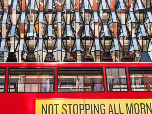
Last week I was walking along Oxford Street in London’s West End when I came across a very modern and unusual glass façade. Cue an image. Classic London buses were continually passing by and provided a strong visual contrast to this façade.
 This is the image I captured first. I was attracted by the slogan on the bus.
My mistake – I cropped too tight when I shot the image and left myself a difficult image to align correctly with the slogan creeping off the edge of the image. I’m a bit of a stickler for correcting leaning verticals and sloping horizontal lines. I did the best I could, but I felt the image was shoe-horned a bit too tight.
 So I cropped it tighter still back home! That may sound weird but it allowed me to get all the lines straight (avoiding the rather oddly sloping lettering in the right corner of the first image). And it seemed to add tension to the image, emphasizing the two elements of the composition.
Meanwhile back in London, realizing my poor cropping, I hung around for another 15 mins waiting for another bus with the same slogan on it to pass by. It never happened. All the buses were different. I had widened the lens and in desperation shot the third image.
 Different slogan but I liked the flow of it, despite the slope, and certainly the image had more ‘space’. There was even a face at one of the windows of the bus.
But which one works best? It’s time for your input please. Which one do you think is the best visually and compositionally, or conveys a message?
Do comment and let me know your opinion.
And don’t forget, if you like this blog, why not subscribe to it. Just fill in the widget in the sidebar and you’ll never miss another post.


I don’t have your ‘eye’ Andy, but the middle one (“Not Stopping”) does it for me. Can’t really explain why, it just does 🙂
LikeLike
Thanks Paul. The second one is geometrically three rectangles nested inside each other centred on the bottom right corner. I like geometric images. so far its 2:0 in favour of this image. I’ll be interested to see what others think.
LikeLike
I do like the second image best. I try to correct lines in photos whenever I can myself. I understand your urge to maintain perspective in that respect. Some might think the diagonal lines in the last photo give it more tension but I think there isn’t enough of a diagonal to do that in this.
LikeLike
Thank for your comments Ken. So far both commentators opt for the second image. The lesson I learnt from this is not to crop too tightly at the capture moment – you cannot rely totally on the image captured being identical to what the viewfinder shows (especially with a digital compact). And the crop can seriously limit what you can do with the image later.
LikeLike
I prefer the first one, Andy…it’s not as up-close and “in your face”…allows greater appreciation for the building (?) windows and the full slogan on the bus. I think a photograph of just those windows, maybe tilted at an angle, would be a striking visual, as well….
LikeLike
Thanks Scott. A valid argument. Too tight a crop when you grab the image can create problems. I learnt a lesson about that.
LikeLike
You’re welcome, Andy.
LikeLike
Very cool! I like the tight cropping..the abstract mirror effect!
LikeLike
Thank you Marcie
LikeLike
Great images and a brave man to challenge oxford street crowds.
LikeLike
Oxford Street can be ‘mad’. Thankfully I was shooting over everyone’s heads
LikeLike